Thursday, September 22, 2011

Lab 2: Down the Ocmulgee River

For this trip we measured the depth of the Ocmulgee River in downtown Macon and too soil samples to count the amount of clams we could find.


Here's the basic transect line we used when we were measuring the River. Here are the results:

To give you an better idea as to the conditions we were operating under, he's a picture I found of Macon in 2007 from Google Earth:

As you can see, the sandbar in the middle has been reduced to two smaller ones. In this picture you can see more readily why the clam populations found in the Ocmulgee would make more sense.

Here's the Clam Data:

Compare the locations of the clams with the 2007 map and you'll see the clams tend to live best when in a location with good current but shallow water, such as the 5 marks at the top and the higher marks towards the opposite of the River on the western side. These locations had shallow water, but water that moved faster than the 0 marks or 2 marks.

To give some Non-Maconites an idea of what the River has looked like in the past, here's our transect line in 1994 a few months before the Flood.

Notice no sandbar at all, and the relative height of the river compared to the field that would later become part of the RiverWalk towards the North of the Transect Line. When Macon's not in the middle of a horrid drought, the Ocmulgee can be a very powerful and full river.

Well, that's the 2nd Lab in this class, feel free to comment!

Thursday, September 8, 2011

Cartography Lab part 3

For this assignment I was to create a map with symbols on Googleearth.

Here I have my approximately 2 mile sphere of influence. Being that I don't have much money I can't exactly go very far, so I mostly stay inside of downtown. The path you see is my commute from School to Work and back, and the pushpins are places I've been employed at. My current employer is in the Fickling Building.

Cartography Lab part 2

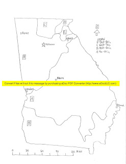
In this section, Dr. Rood decided to have us hand-draw a map of Georgia and it's precipitation zones in an Isametric style. Here's mine:


Due to overzealous software developers, I have a horrific yellow stripe across my beautiful drawing, but unfortunately that was my only choice since Blogger can't have the decency to take PDF files.

Cartography Lab part 1

In this week's lab we learned about maps and how they're used to help us visualize and convey information.

The first type is an Isarithmic Map. An Isarithmic Map is used for visualizing zones with different characteristics. Here is a map of Africa showing the various zones of population density:

The next type of map is a Chloropleth map. This map is a type of Isarithmic map, but it's based in units for a whole area, similar to election state maps. Here's a map of Female to Male ratio per state:

This next map is a Proportional Symbol Map. This type of map uses a symbol, usually a circle, to indicate the amount represented. This next map shows the overall population of the capital cities of the world:

Our last map is a Dot Density Map. This map uses small dots to represent a certain amount of units, and it is useful for visualizing density in an area. This is a Dot Density Map of the population density of the United States: